In what ways does your media product use, develop or challenge forms and conventions of real media products?

Upon intense research into our genre, R&B/Hip Hop, we noticed a few major trends, our target convention to follow and deviate from was the voyeuristic treatment of the female body, as well as the point of view camera angle that would scan up and down a females body, we found that in certain music videos, such as the original music video for our chosen song would treat the female body as an object. We challenge this as we made our video look like a typical genre specific video and convinced people into believing it was targeted at men who like watching such videos, this changed, however, when the focus switched from girls to boys, perhaps shocking the audience, this shock appeal gave a comic effect to the video, which the song is notorious for, it has been used in many films and television, such as ‘Norbit’ and ‘Family Guy’.
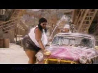

We found many inspirational videos that have helped us develop our music videos, mainly in film, we saw a carwash scene from the film ‘Dodgeball’ which includes an all male carwash team being completely dominated by a female team, the trade was going to the women as they were more attractive to the male audience. We also saw a parody of our song appear in the film ‘Date Movie’ which includes a woman dancing around the streets (similar to ‘Singing in the Rain) in a fatsuit.
A theory that we decided to take advantage of was Laura Mulvey’s Male Gaze theory, which outlines the fact that in music videos, the female body is treated voyeuristically from the male eyeline. We used this to our advantage and did the same for the boys and girls in our music video.

How effective is the combination of your main product and ancillary texts?

Upon intense research into our genre, R&B/Hip Hop, we noticed a few major trends, our target convention to follow and deviate from was the voyeuristic treatment of the female body, as well as the point of view camera angle that would scan up and down a females body, we found that in certain music videos, such as the original music video for our chosen song would treat the female body as an object. We challenge this as we made our video look like a typical genre specific video and convinced people into believing it was targeted at men who like watching such videos, this changed, however, when the focus switched from girls to boys, perhaps shocking the audience, this shock appeal gave a comic effect to the video, which the song is notorious for, it has been used in many films and television, such as ‘Norbit’ and ‘Family Guy’.

Like many R&B videos, it is a conceptual driven video, it does not feature a performance or a storyline, it is just a bunch of random clips mashed together, the editing is, like most videos, tailored to the beat, this adds a professional touch and makes it seem like the real thing, we developed some forms and conventions of real media products by challenging them, instead of making a video that appeals to only one particular audience, it adds a comedy side which can appeal to anyone the video is deemed appropriate for, this means it can make more money and even be virally spread, which is a very desirable trait in the modern world as viral ‘hype’ can be pivotal for the success or failure of a media product. It is very rare to see comedy in an R&B or Hip Hop music video, because rappers and artists from that genre like to take themselves seriously or have a certain persona that they want to keep up as it may gain them more respect, Kelis’ original video was not comedic, but the interpretations in TV and Film have been mainly comedy driven, this may be because it is a gimmicky song that has been overplayed on the radio and has lost it’s appeal as a serious song.

We found many inspirational videos that have helped us develop our music videos, mainly in film, we saw a carwash scene from the film ‘Dodgeball’ which includes an all male carwash team being completely dominated by a female team, the trade was going to the women as they were more attractive to the male audience. We also saw a parody of our song appear in the film ‘Date Movie’ which includes a woman dancing around the streets (similar to ‘Singing in the Rain) in a fatsuit.
A theory that we decided to take advantage of was Laura Mulvey’s Male Gaze theory, which outlines the fact that in music videos, the female body is treated voyeuristically from the male eyeline. We used this to our advantage and did the same for the boys and girls in our music video.

How effective is the combination of your main product and ancillary texts?
To build an effective combination of work we decided we must create a brand or some kind of theme that can be noticed throughout our project, I believe we created a brand image and this proved very effective as it not only could be seen but enhanced our project in many ways, it is enhanced as we presented our idea in the same way throughout, making our video and possibly our production company recognisable straight away.


In the video we used many branding elements, these included fast editing, the voyeuristic treatment of the male and female body as well as copycat shots that mimic typical hip-hop images, this development shows that we have the ability to mimic a genre in such a way that our audience will notice that we are parodying. This parody also shows that we can target an audience and bring them something which will be humorous and with the help of camera work and editing we can develop this into such a product that is successful. As the music video is the bulk of the project, it was the first thing we thought about, the magazine advert and the digipak were side projects completed with the music video in mind, this means they were designed to be effective in combination with the main product.


The digipak can be related instantly to a few moments in the music video, this is where our model’s eye colour changes as she blinks (the changing eye colour is the focal point of the album and the album cover) and another part of the digipak which is relative to the music video is the background, which looks just like pink food colouring or ink being dropped in water, one of the shots in our music video includes this. Our first idea for the digipak was simply a female face with a thick moustache, which, I think would work well in combination with the music video as it has the same comical switch of male and female, but we decided that this would not look professional, after all we wanted our product to look as much like the real thing as possible.
 I believe our use of the colour pink is a main theme of the whole project, our blog is even pink! This was because of the song, ‘Milkshake’ which we believe is very much a pink themed song. On the back of our digipak we used certain items that you would often see on a CD, the production companies and the label, a barcode (which will take you straight to our website if scanned by a QR scanner app) and I believe this enhances it.

The magazine advert for a single and a music video typically features the album cover as a main attraction, so we decided we would do this, we provided two different magazine adverts, one including our album cover in the middle, and the other held a deconstructed version of our album cover, revealing more of our background, this follows the established norms of a magazine advert as it is bold and it has the barcode and record label logos as well as the artist name and release date.


The magazine advert for a single and a music video typically features the album cover as a main attraction, so we decided we would do this, we provided two different magazine adverts, one including our album cover in the middle, and the other held a deconstructed version of our album cover, revealing more of our background, this follows the established norms of a magazine advert as it is bold and it has the barcode and record label logos as well as the artist name and release date.

Our target audience profile was those aged between 16 and 25, we targeted both males and females as well as fans of all music, but specifically those who listen to garage and R&B, we decided this because of some of the adult themes of our music video, as well as the fact that the song appeals to this audience, the song has been a massive success in the humour department as it has many intertextual references throughout television and film. As our music video is designed with humour as a key aspect, the audience must be able to understand the fact that it is not a serious video designed to appeal to men or women’s sexual desires. For this reason we have excluded the older population from our target audience.
We tailored our music video in several ways to appeal to this audience, we put in several voyeuristic images that would not just appeal aesthetically to the male/female viewer but would lead the female/male viewer to believe it’s “just another hip-hop video” but then be astounded by the switchover. I believe the audience will be hooked by our music video as it is very easy to watch but hard to pull yourself away from, I also believe that our ancillary texts are so well developed that they will make our target audience want to watch the music video and look into more of UV PRODUCTIONS work.

After we finished our music video and ancillary texts we received lots of compliments, this was from many of our target audience, unfortunately, as we only have access to a few audience members at the top end of our spectrum, the majority of people who have seen it are in the bottom end, this makes our data a bit off key, however we have had extremely high demand from classmates and those from our school to see the video, this is partly due to word of mouth and partly because of the fact two boys were scantily clad and washing a car which proved a big hit with those of our age, laughing and shock horror was common among the viewers.

After we finished our music video and ancillary texts we received lots of compliments, this was from many of our target audience, unfortunately, as we only have access to a few audience members at the top end of our spectrum, the majority of people who have seen it are in the bottom end, this makes our data a bit off key, however we have had extremely high demand from classmates and those from our school to see the video, this is partly due to word of mouth and partly because of the fact two boys were scantily clad and washing a car which proved a big hit with those of our age, laughing and shock horror was common among the viewers.


How did you use new media technologies in the research, planning, construction and evaluation stages?
In our whole product we used an arsenal of equipment ranging from the latest Photoshop programming to our blog and what you are reading this on, Wix.
 Our first venture into the technology side of media was research, we used sites such as google and youtube to look at videos that inspire us and create a mood board, we created a wordstorm using a site called Wordle, this helps you create a great way to present a few ideas. We did present our idea using Powerpoint and recorded this, you can see this on our blog. We created a blog on blogger which we posted everything to do with our project onto, blogger allows you to tailor your page in many ways, we tried out many backgrounds throughout our project and found our present one to be the most effective, it opens up into many different views of our posts, a limitation of our previous themes was that we could not post big enough pictures that justify our work, this was the main reason for a theme change.

To produce the magazine advert and the digipak we used a stills camera, Nikon D40 and the basic shooting facilities such as a green screen which were available for us in the media centre. The green screen made it a lot easier to edit the photos we shot. To edit our digipak together I used photoshop, inside photoshop we installed brushes and templates to ensure our digipak was smooth and looked professional, obviously we didn’t have the facilities to print out the CD and digipak in order to distribute them for feedback, but we made it look as legitimate as we could.


The camera we used in order to film our scenes we used was a Nikon D40 with automatic or manual focus and exposure and wide screen capacity. We also used a tripod with pan and tilt controls. We experienced several problems with the filming including only having one camera and one chance to get a shot (milkshake smashing) and getting the right focus. Many shots had to be re-done after we keyframed them in our editing software as they were not clear when zoomed. We eventually got the hang of using the technology to it’s arête.
 For the editing of the music video we used Final Cut Pro Express, this took a while to get our head’s around but we ended up with a good edit, we used keyframing heavily, as well as special effects such as colour enhancing. We had problems with the speed of editing as it is a lengthy process but learning the shortcuts greatly enhanced our ability to save time.


